Mike – I applaud your interest in, and efforts to optimize the UI for different screen sizes and client types. Clearly there is a market for that and any good businessman tries not to shut clients out with a lack of choice.
If I may offer a little hard won advice based on 30 years of software and UI design:
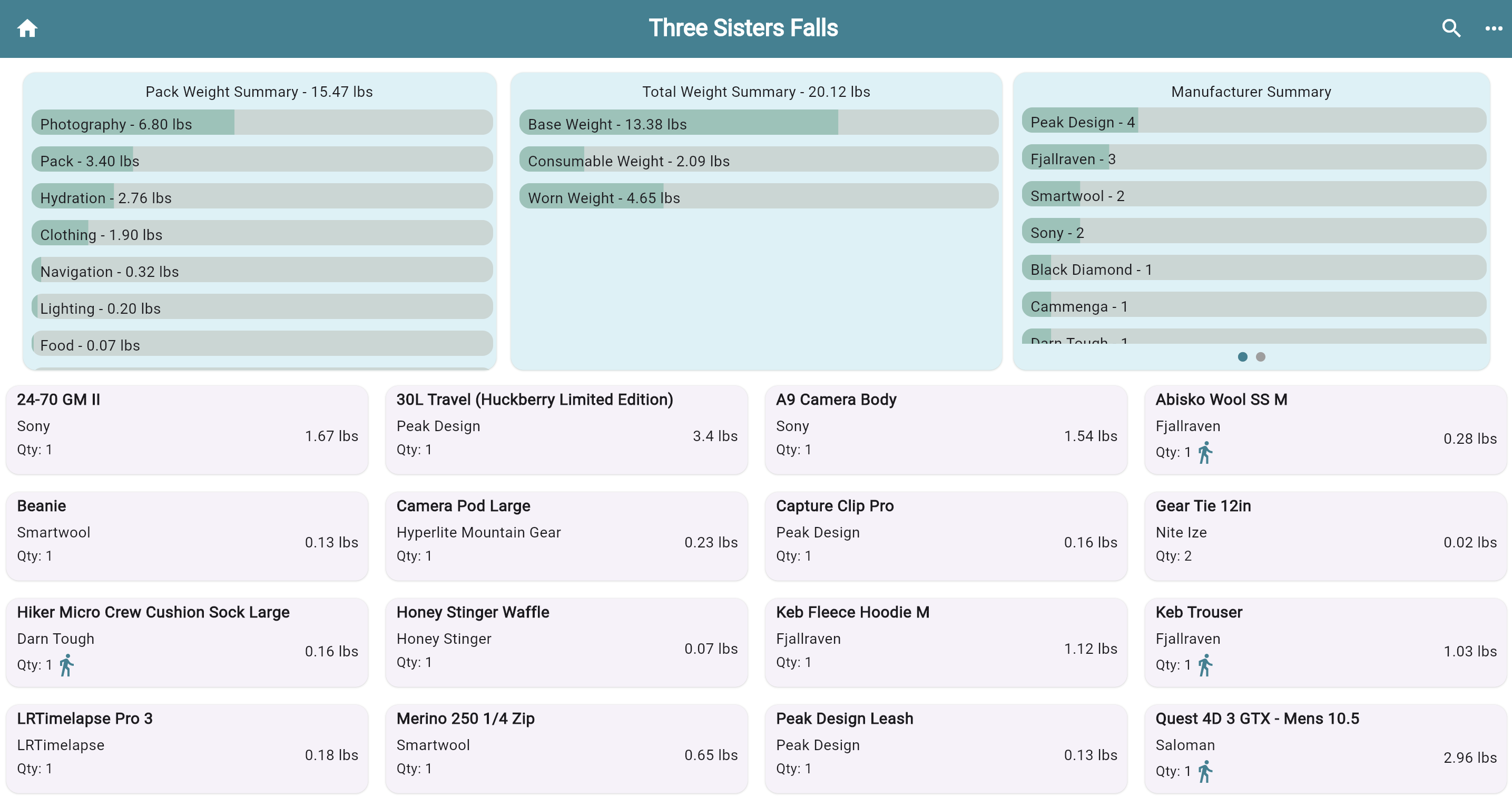
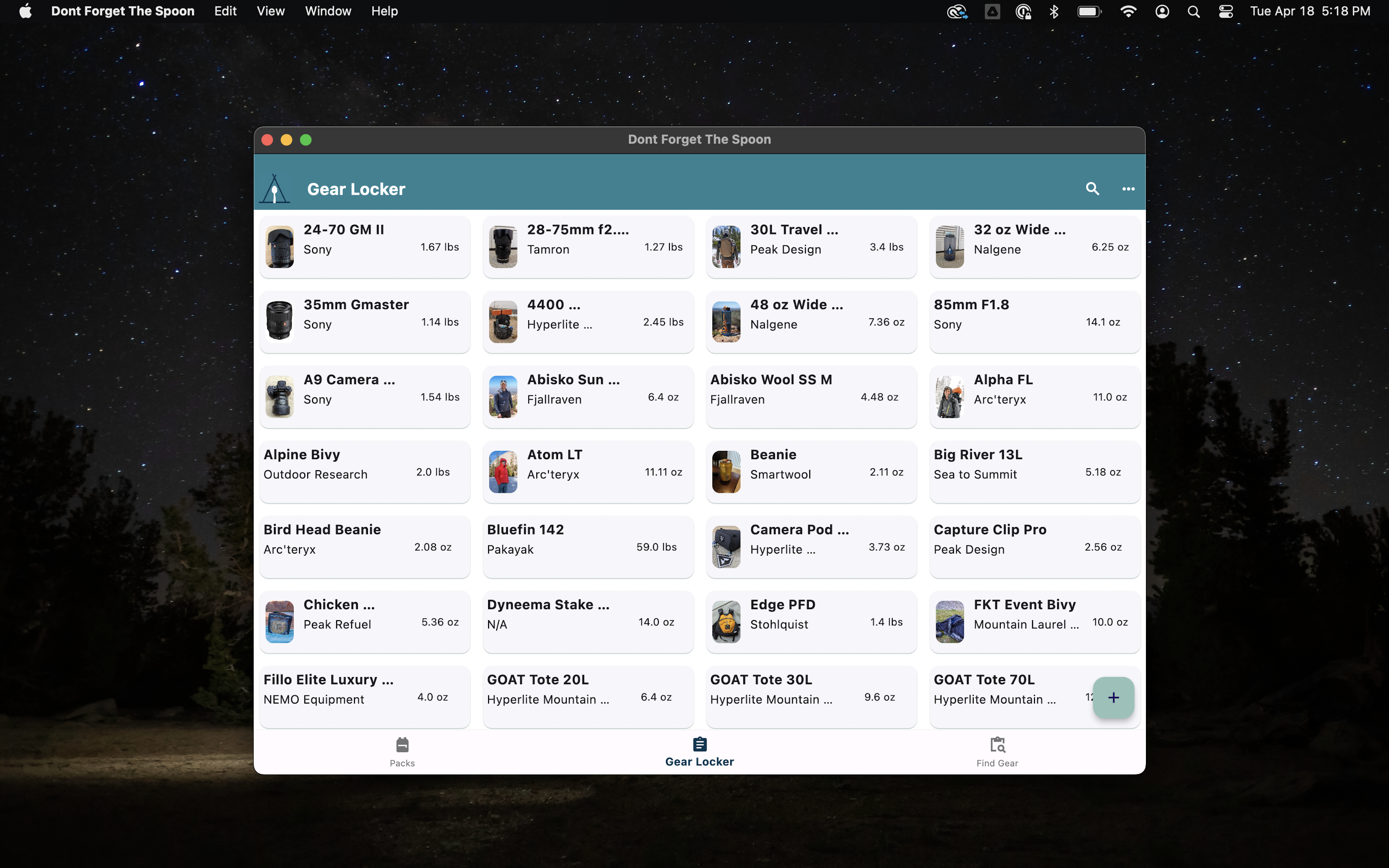
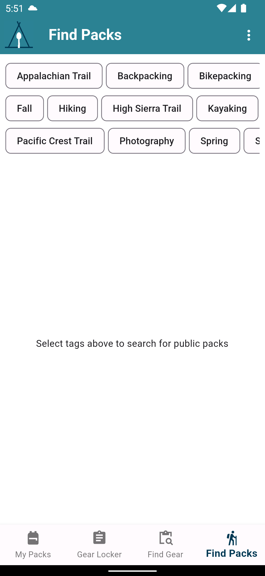
Items displayed in a grid can be very good at optimizing space…more items displayed in a smaller space. However humans generally do not do a good job of converting a grid of items into the concept of a “list”. For instance it’s hard to know wether the list is ordered down-then-across, or across-then down, or even what the order criteria are. A grid is also harder to scan for a particular item.
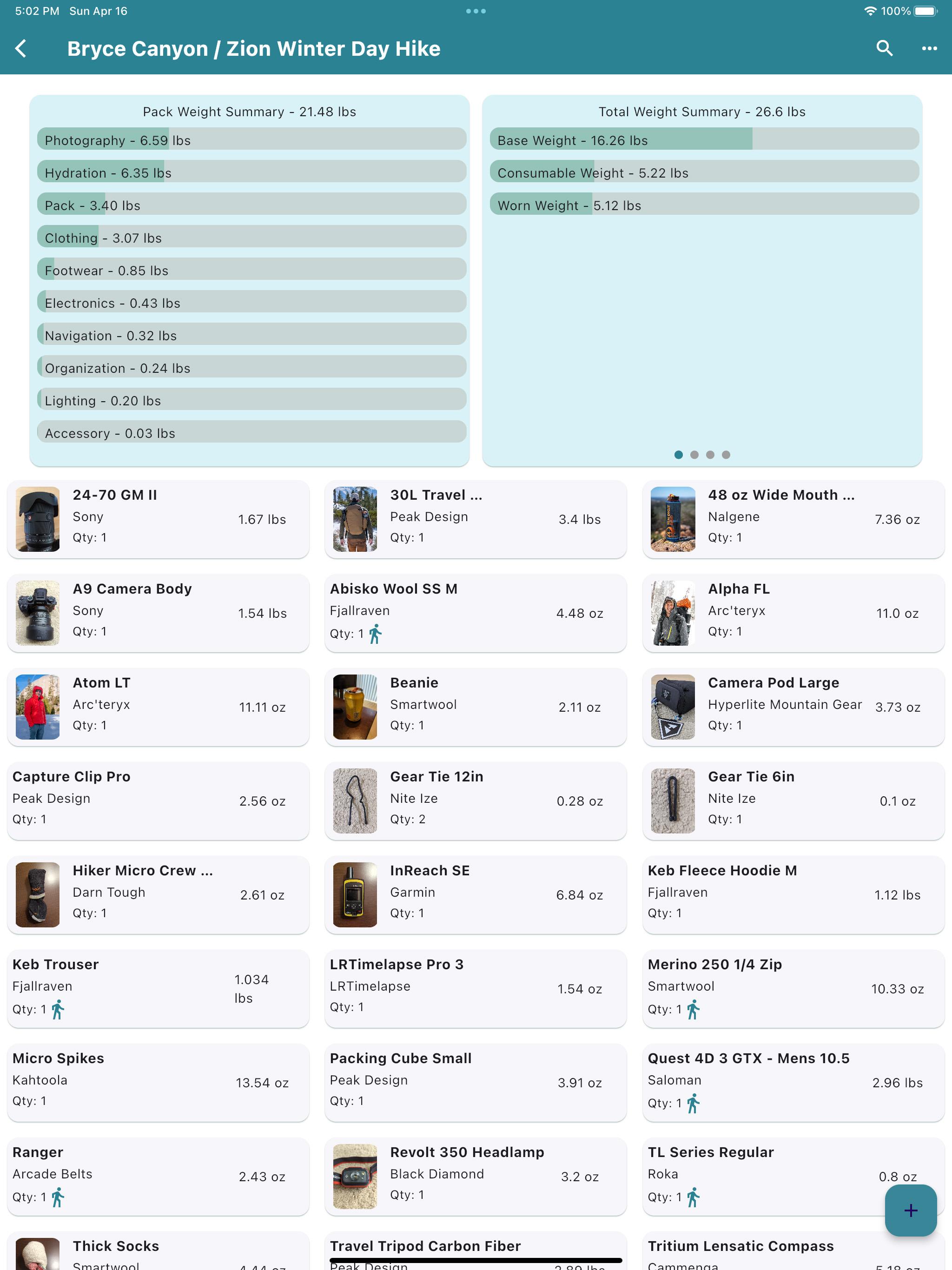
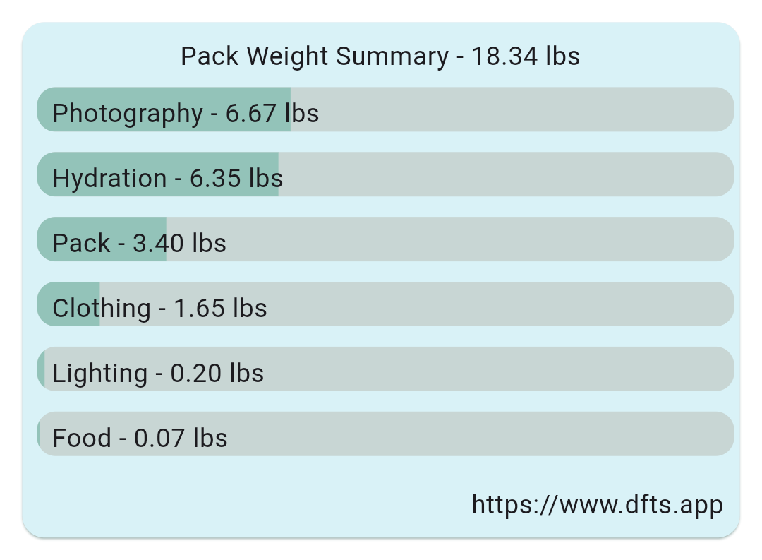
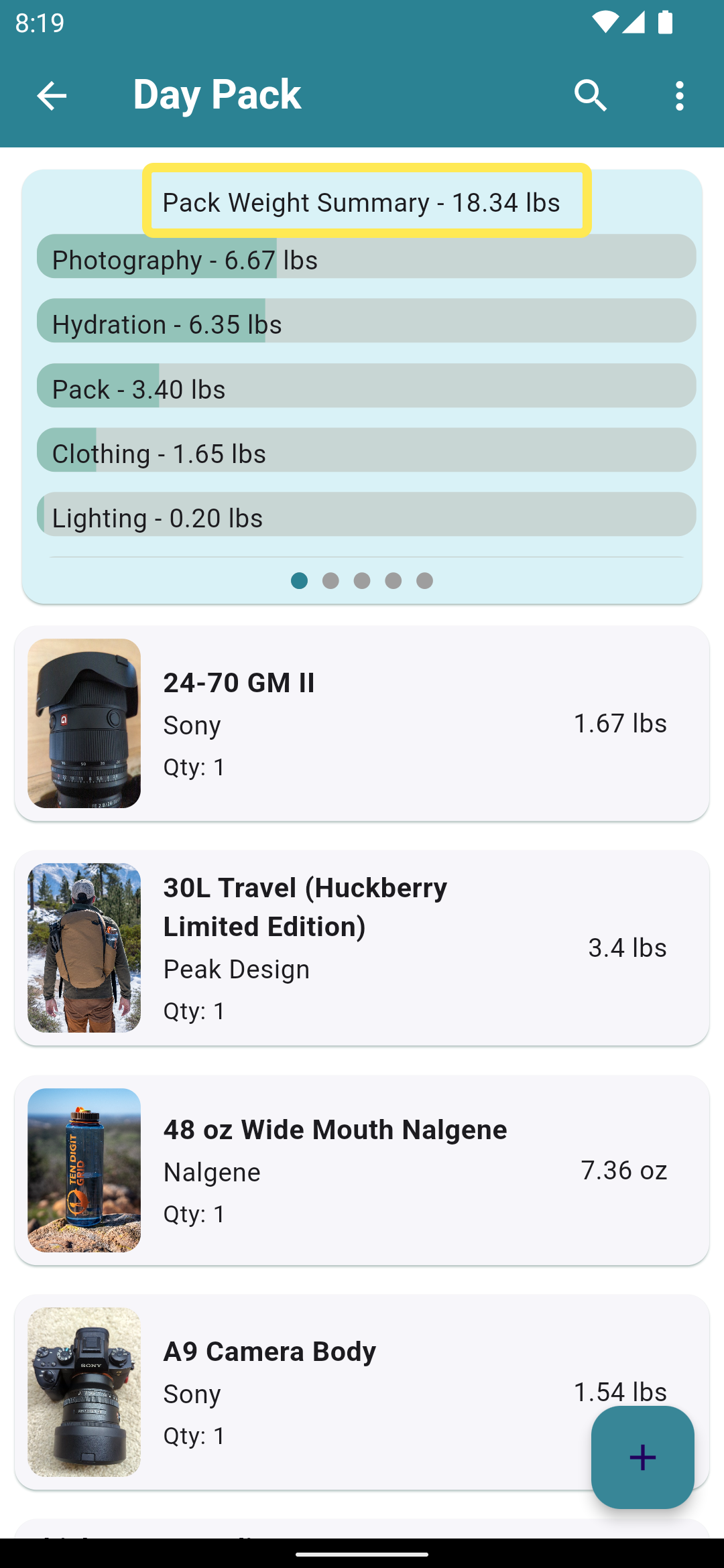
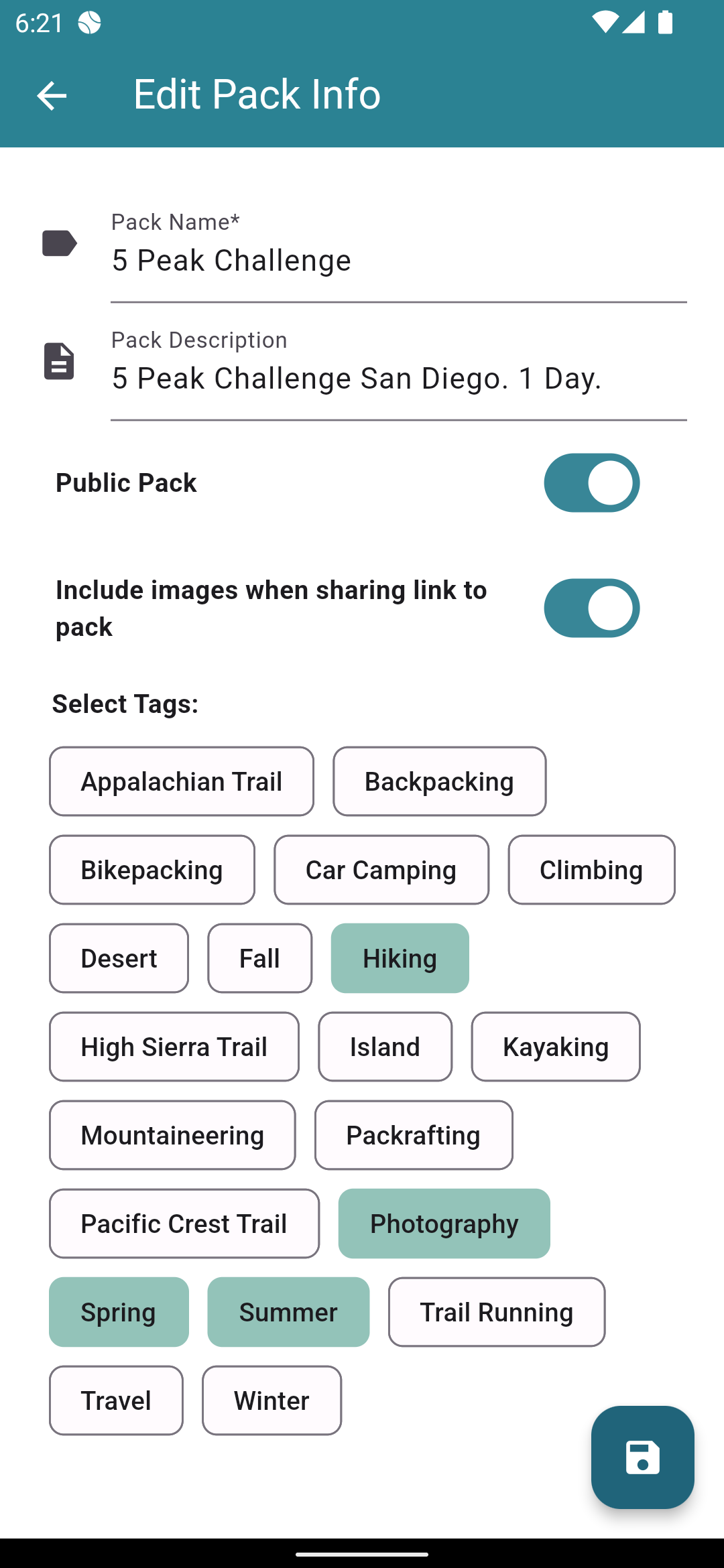
Personally, I use your app on an iPad in portrait mode and never considered the UI to be a problem. The only criticism I would offer of the “old” UI would be to attempt to minimize the height of each item in the list. By making each item take up less vertical space more items can be displayed per page. Using the additional available screen width of a tablet or browser might make this easy to accomplish. You might also consider a “minimal” list display option with simply the Item name, weight and quantity, eliminating the manufacturer/picture/etc. For me, the most useful display would be the most information dense. The pack summary panes at the top of the display could also be moved to a dedicated view.
That said, people have different opinions and like different things. Some may perfer “everything on the one page”, while other prefer to zero in on the task at hand and eliminate any “noise”. So may I suggest that you offer a choice of display types? Many (most?) shopping websites offer to display results in Grid or List format, and some offer a list view that does a very good job of maximizing the number of items displayed per page.
Thanks for your attention. DFTS, it is my go-to packing tool.