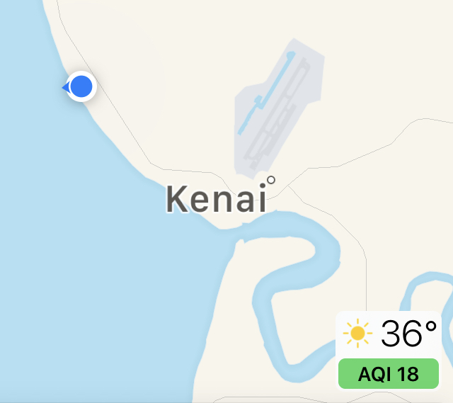
If you have a iPhone with iOS 12.2, it has a new feature in Maps. Down in the lower right (just below the temperature) in yellow is the new Air Quality Index AQI: at my house today, it is 64.
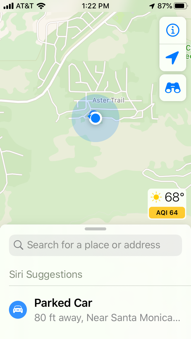
Here is the index meaning
0-50: Air quality is good. Color: Green
51-100: Air quality is moderate. Color: Yellow
101-150: Air quality is unhealthy for sensitive groups, like people with allergies. Color: Orange
151-200: Air quality is unhealthy. Color: Red
201-300: Air quality is very unhealthy. Color: Purple
301-500: Air quality is hazardous. Color: Maroon