I love the new look! Very refined and clean and visually simple. Many little things could use cleaning up but as it is now, it's very user-friendly already.
– I agree that the vertical space is way too long. Things I'd like to see change to reduce this are (1) tighter top two banners, (2) smaller photo rotation.
– I don't find a 'Featured' spotlight appealing. If you're not already familiar with the product range, then this area isn't at all informative. In that case I'd rather go and see the entire product range at once for comparison. If you're stuck on having a 'Featured' tab, you could introduce a rotating selection like your photo banner above, but with a brief blurb about its features.
– A little more visual consistency with titling the mini banners for your three 'Shop' categories.
– Clicking on the 'Enlightenment' tab by itself brings up nothing. I'd at least one to see the sub-tab options linked here. I also don't think the 'Contact Us' sub-tab can be intuitively found here, though I don't have a better suggestion off the top of my head.
– I'd like more consistent photo widths on all pages, for example in 'Quilts 101'.
– Better blog layout to visually delineate individual posts and cut down on the info presented in the initial page. Too much scrolling to get to older posts, and the titles don't immediately jump out. The format I typically like is one a lot of outdoor bloggers use, where only the first portion is visible and you click to read the rest. The format in 'Shaking Things Up' is too wide.
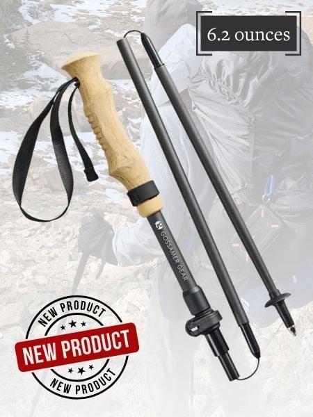
The latest product photos are beautiful, by the way!