Topic

New Enlightened Equipment site needs scrutiny


Forum Posting

A Membership is required to post in the forums. Login or become a member to post in the member forums!

Home Forums Commerce Gear Deals New Enlightened Equipment site needs scrutiny

  • This topic is empty.
Viewing 25 posts - 1 through 25 (of 66 total)
  • Author
    Posts
  • #1315224
    Tim Marshall
    BPL Member

    @marshlaw303

    Locale: Minnesota

    http://enlightenedequipment.mybigcommerce.com/

    Before I replace my current (frustrating) site with the new one I'd really love it if some of you guys would check it out, kick the tires and let us know how its working. If you guys give me some good feedback i'll post a few exclusive deals here in a few days :)

    -Tim

    #2089249
    Matthew Perry
    BPL Member

    @bigfoot2

    Locale: Hammock-NOT Tarptent!

    Love the new site, Tim. Couple things…
    1–when clicking on a larger image, it actually pops up a smaller image than the original one on the page. I HATE that.
    2–how about a customer submitted gallery showing your gear in use?
    3–ever thought of doing some instructional videos for your items? Make a video page?
    4–How about having a "links" page? Those are always fun and you might get a kick-back from other cottage guys?

    Overall, you did very well. Good job, buddy!

    Matt

    PS–AWESOME flat rate shipping.

    #2089252
    Valerie E
    Spectator

    @wildtowner

    Locale: Grand Canyon State

    Always happy to try to help out…

    It looks very clean (good!), and I like the photo of the workshop (makes things more personal – you won't see that on Mountain Hardwear's website!).

    It seems to be very well equipped with conveniences, like color swatch zoom, product photo zoom.

    Well organized, with things where you would expect them to be (product categories at left side of screen, options via pull-down menus at top, etc.).

    The only suggestion I might have (and I don't think it will be worth the trouble) is to ask whether it would be possible for people to see a visual of their color choices in a photo (so if I want a charcoal interior and a red exterior on the Revelation, could I see a photo of that when I make my selection? Again — probably not worth the bother, but some people are not very good at visualizing things…

    The cart is easy to manage (putting in/deleting items).

    I think it looks very professional, very clean, and functions well intuitively.

    #2089272
    Eric Lundquist
    BPL Member

    @cobberman

    Locale: Northern Colorado

    I found that if you are on a product page (ie. Revolt) you can change the options such that no down fill option selected (it is not greyed out) which changes the pricing.

    Enlightened equip webpage

    EDIT: I found that when choosing add to card you're alerted that you have an invalid combination of options. So maybe it's user error.

    #2089274
    M G
    BPL Member

    @drown

    Locale: Shenandoah

    "The only suggestion I might have is to ask whether it would be possible for people to see a visual of their color choices in a photo (so if I want a charcoal interior and a red exterior on the Revelation, could I see a photo of that when I make my selection? "

    +1

    Also,

    Would be nice to have lengths and widths for the different options right there on the page rather than in a separate sizing area which is kind of buried away. This is key information and it should be prominent and as easy to find as the weights.

    Lastly prices seem way different. I'm assuming this is not final, but would be nice to know if you are planning a major pricing adjustment. With this relaunch

    MG

    #2089277
    James Marco
    BPL Member

    @jamesdmarco

    Locale: Finger Lakes

    Looks good, Tim.

    I might change the menu bar (to the right of the logo) down a line or two. It looks a little rough as it is.

    The options chart shold be a little more obvious, that is where the customer is usually ordering from. Cost, fill weight, shell weight/material,etc are all there. Navigation was a little hard since I am going blind these days…(nah, hey, read too small.)

    Overfill? Quantity, type, and amount?

    I didn't see any pads. Quilts derive about 1/3 of their warmth from the pad. You should decide on one type, then standardize your measurments around it. Some may get the impression that a 30Degree quilt will keep them warm at 30F without a pad, ouch. Colder? Not sure how this would go over.

    Looks real good, other than a the few minor points.

    #2089283
    USA Duane Hall
    BPL Member

    @hikerduane

    Locale: Extreme northern Sierra Nevada

    It does load faster now, thank you very much. Not another deal, I've spent enough money this last year on upgrades from you and others.
    Duane

    #2089288
    Peter Boysen
    BPL Member

    @peterboysen

    Hey, I'm Peter (an Enlightened Equipment employee, and put a bunch of the site together).

    As for 1. We completely agree. Unfortunately the photo viewer is integrated with Bigcommerce, so we don't get to choose the size for that (or even make it unclickable). We're trying to figure out a workaround, but it probably won't be done in time for the full launch of the site.

    2. Customer gallery is a great idea. For now we'll be happy to post any user photos on our end, but it would be great to add a system to submit them more directly.

    3. Instructional videos is definitely going to happen (and more instructional content generally).

    4. We like a lot of gear, and we're going to be putting together a lot more posts on the blog, including some features about gear we really like and companies we'd like to see get more attention.

    #2089289
    daniel B
    Spectator

    @dbogey

    Locale: East Coast

    Here are some things I see – I'm a customer also.

    – The rotating pic is taking up all the real estate on the page. I like the intro pic but then its wilderness pics. Heck, put a family pic of everyone in their quilt. Show someone using it. Make it cheesy, get my attention.

    – Your menu is not changing when you mouse over. http://imgur.com/luf7CKq You can see that the "About" and "Enlightenment" is highlighted even though I hovered over Enlightenment.

    – Your featured item isn't visible unless you scroll down the page.

    – The consistency of the Shop Items Text. One is in the middle of the graphic, one is highlighted and the other is stuck in the lower right corner with a totally different font size.

    – to search for something you must click the Search Icon then enter your text there is no button to click to even search then. Get rid of the "s" key to open, "escape key to close"…. If im on my mobile phone this makes no sense.

    – Your menu. Instead of shop make it products and have that expand to your product selections.

    – Show Customers testimonials. I've bought one of your quilts and love it (I really have). Its light and the pricing was perfect! Why should I buy from you when REI sells bags.. Beacuase they are confortable, light and a great product made here in the U.S.A.

    – Who is Tim Marshall? This is at the bottom of the page. Get personal with your customers. I'd like to see a pic you and all your staff and maybe a video of your day to day ops.

    keep it simple, keep it clean and use the space effectively.

    A good reference for Visual Design – http://www.edwardtufte.com/

    #2089294
    Peter Boysen
    BPL Member

    @peterboysen

    We would definitely like to be able to show each color combination, but based on what's currently available, that would be 330 or so combinations. We do plan on continuing to add more photos of different color combinations, and to add a customer gallery as well, but for now the fabric swatch selector will have to do. (On the plus side, those colors in the color picker are actual scans of the fabrics, so the color should be right on)

    #2089296
    Anthony Huhn
    BPL Member

    @anthonyjhuhn

    Locale: Mid West

    The pricing on the 50 degree progidy is wonky. The regular length is $155 regardless of width and the short/long are $150 regardless of width

    Anthony

    #2089301
    Peter Boysen
    BPL Member

    @peterboysen

    Good catch Anthony, thanks. The width pricing is correct (because we can only cut the insulation for synthetics by linear yards, so whether you get a slim or wide we have to cut the same amount off the roll), but I definitely missed the pricing setup for the 50° Long, so that's fixed now.

    #2089335
    Andrew Williams
    Spectator

    @spf3million

    Locale: Midwest

    I think this might be what Matthew Perry mentioned but when hovering over one of the featured items, a "quick view" option is available. When clicking on the feature item photo, it brings up a box with a photo that is cut off and no way to move it to view the item. You have to click through again to get to the item page.
    quick view
    It seems like you should be able to move the image around somehow in the quick view, or just omit the image entirely.

    #2089359
    Wade Ford
    BPL Member

    @cwford

    Locale: NTX

    In general I would say the site is great. The design is much cleaner. However the pages seem to be too vertical. Most monitors are wider than they are tall. The header (space just below the dark bar) takes up too much space.I have to scroll up and down a lot.
    I think you could combine the 'Add to Wishlist' and 'Email a Friend' button with all the social media buttons.

    I would like to see the measurements and weight total as I clicked on different options. Its quite tedious to change an option and have to scroll down to see what its going to weigh. I should also be able to see the measurements in the specs instead on a different page.

    I would like the fabric description to show up with the color swatch instead of in a tooltip. The tooltips seem to be a bit picky as to when they will display.

    The 'None' option for the Weather Resistant Strips overlays a radio button (in Safari). The button is also functioning as a check box if I click on it multiple times.

    All the separator lines seem unnecessary on the product detail page — its quite easy to discern the options without them.

    #2089370
    Aaron Sorensen
    BPL Member

    @awsorensen

    Locale: South of Forester Pass

    Hi Tim,
    Great site. I have some more to add.

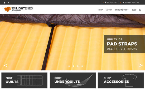
    The first and foremost thing I would do is simplify the main page and make it read better.
    If you had the info of each quilt laid out like the quilt page but under the shop quilts, you would make the main site page much better.
    Under the Shop Under-quilts would be the same info for them. just have the accessories smaller as to not take away from the layout.

    You also have "Shop Quilts" then when you go to the page it says "Top Quilts"
    They should be the same.

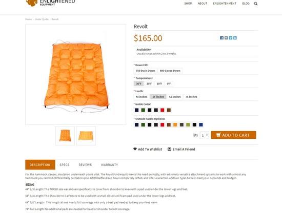
    On the main page, having the top corner cut off just wouldn't look as good as the entire bag.
    It only blocks of like 6" so it wouldn't take much to fix.

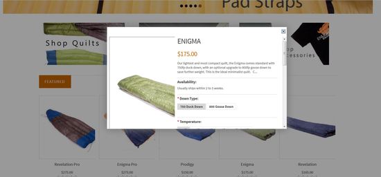
    Quick views vs full views IMO are dumb. It would be cool though if when you put the mouse over "quick view" it would automatically generate a quick view on the same page.
    Having that quick view takes you to the same page anyway. Doesn't need the complication.

    On a huge plus, when you go to shop quilts, that page is awesome (but all of this should be on the main page).
    And the quilts are perfectly centered.
    The featured items button isn't really necessary with only 9 items?

    The Revelation and the other quilts that use the straps should have a picture of them in use on that quilts page.
    This makes buyers know what they are getting without having to figure it out in the options or wherever it is.

    I would make the color square you pick at least twice the size. I am looking at it on my computer and wish it was bigger.
    A lot of people will be looking on their phones and won't even be able to really tell the color.

    I liked your old specs/ weights 100 times better than the very confusing way it reads now.

    On the length and width option, I have to dig and dig to find what a "Wide" or "Slim" size is.
    Shouldn't have to dig. It should show you.

    Oh and this.
    – Seconded on implementing an incremental weight counter that responds in real-time as the user configures a quilt.

    Love how good the pictures look.
    You can see the quality in the pictures.
    The changing price as you select the options is great. You used to have to select a temp and fill then go through the rest, where now it is all inclusive.

    #2089372
    Will Newton
    BPL Member

    @newts-2

    I cannot say enough good things about EE. Love your quilts, amazed at your customer service, want you to succeed on a massive scale — so know the following feedback comes from a very satisfied repeat customer, who also happens to teach UX design for a living.

    – Leading and tracking of the type on the splash gallery are all over the place. Standardize on a certain type style and have it in the same place on each slide, so the user doesn't have to go looking around for it.

    – The "Shop [category]" buttons are visually cluttered. This would be a good place to have a consistent type treatment over an opacity-treated image extending to the edge of the clickable area, or over a line drawing of the category image — something to meaningfully distinguish the buttons from the splash gallery and make the functionality immediately apparent to the user. As it is, the eye doesn't know where to rest, and those three sections don't immediately read as buttons.

    – In the left-hand "Shop by Category" bar when browsing quilts, I would suggest some sort of visual distinction (size, color) between the "Category" section and the "tags" section, as the first is arguably where most users will go, and as it is the user is confronted with an unmanageably long list. Making the 'Category' list more prominent than 'Tags' cuts this down to a reasonable set of options.

    – Seconded on implementing an incremental weight counter that responds in real-time as the user configures a quilt, as well as reducing separator lines on product detail page; they make the eye lurch to a stop after each section.

    Hope I'm not Photoshopping out of turn, but to illustrate, an incredibly quick and dirty mockup of type & visual hierarchy for splash page, with vertical space tightened up a bit:

    mockup

    Good luck, guys. Can't wait to see what EE has up its sleeve next.

    #2089392
    Joe S
    BPL Member

    @threeridges

    For some reason, the "other details" page did not load fully the first time on an iPad

    #2089393
    Paul Andronico
    BPL Member

    @jakesandwich

    Locale: Lake Tahoe

    +1 for making the sizing info much more prominent. I had trouble finding it. Love the easy-click selections rather than pull-down menus.

    #2089395
    DGoggins
    BPL Member

    @hjuan99

    Locale: Mountain West

    Keep up the good work!

    The main page splash image should have arrows on the left/right side just like every other site that has a splash page with multiple "images".

    For the product line selection page…I don't like 9 different options there….I like the old way a bit better where you select the enigma line, and then just have options for down quality on the same page you pick sizing and colors. You can use the product line selection page to just be ->

    Enigma
    Revelation
    Prodigy

    instead of the 9 versions….you can use the new found whitespace to describe the differences between the three. Leads to less confusion. I would even highlight the main points:

    Enigma: Lowest Weight, Sewn Footbox, Down Feathers
    Revelation: Adjustable Footbox, Down Feathers
    Prodigy: Synthetic Insulation

    Then a 1-2 sentence blurb about each one.

    Then on the Enigma page, you can select size (junior size, or the adult sizes with their lengths/widths), just like picking color and fill weight.

    I think the picture zooming, clicking, etc works great on the product page…exactly like I would like it to happen.

    #2089428
    Miner
    BPL Member

    @miner

    Locale: SoCAL

    I was looking at the Enigma quilts. The weight chart is different(ie. heavier) for the same options on the new website then your original website currently has. Is this a mistake or does it reflect a design modification that is coming. Not happy with the tiny price increase either. :(

    Issues with the website functionality:
    1) The color option names when the mouse sits over them seems to come up kinda slow compared to most websites I'm on.
    2) The hyperdry down fabric link takes you to a website which just has the label and no information about the down itself.
    3) Weight of the optional stuff (Silnylon Stuff Sack,Elastic under-straps,Pad attachment straps) that the original website has is missing from the new one. Some of us like to know what the weight penalty of using them has.
    4) When using the quickview, the picture of the quilt doesn't size right for the pop up window. Selecting the options in the pop up window doesn't change the price in the window. It does show correctly in the shopping cart.

    #2089431
    Tim Marshall
    BPL Member

    @marshlaw303

    Locale: Minnesota

    Thanks to everyone for your feedback. We will be addressing a lot of the things you've pointed out. We can't fix everything as were limited by the designs and templates of our commerce provider but we will be taking action on the things we can

    The enigma Reg is now heavier and costs more because it's the current Long. We have relisted the sizing so it matches the revelation. The cost and weights haven't changed but the name the size is listed under has. This way all our Regular length quilts are a great fit for a 6' user and will fit users upto 6'3" instead of the Revelation fitting that way but the Enigma reg maxing out at 5'10".

    -Tim

    #2089436
    David Drake
    BPL Member

    @daviddrake

    Locale: North Idaho

    Hi Tim,
    I just ordered a Reg/Reg enigma from you (on 3/30). I'm 5' 6" which put me in between the Short (5' 4") and Reg (5' 10"). Is this still the right sizing?

    As far as your site goes, count me among those who would welcome seeing info about the evolution of your company and a little more about the people who work for you. I've followed your story here on BPL for the past several years–what you've been able to do and your commitment to your community is genuinely inspiring.

    #2089481
    Glenn S
    Member

    @glenn64

    Locale: Snowhere, MN

    Edit: Somehow I missed there was a temp site… thought this was a different thread for some reason.

    #2089503
    German Tourist
    BPL Member

    @germantourist

    Locale: in my tent

    I cannot find shipping costs stated anywhere – especially shipping costs to overseas.

    #2089505
    Steve Chan
    Spectator

    @sychan

    Locale: SF Bay Area

    Just a few points from a quick review of the landing page – I'm looking at it on my Macbook, which has a 15" screen and is probably a pretty big screen for many people coming to the site. This is going to sound very critical, but I'm coming at it from the perspective of a nitpicky web developer who has user centered design background:

    1) When you first arrive at the landing page, it looks nice and clean, but you can't really do anything or see things to buy or features until you scroll down "below the fold" (in newspaper lingo)
    2) There is a lot of wasted space on the top nav bar. You have the black bar across the top for the social networking, login and shopping cart, but a huge amount of wasted horizontal real estate, and then the 2nd level white nav bar for shop/about/enlightenment/blog is too tall and the drop down menus look funny because of the vertical height of the nav bar. A nice clean look is great, but there's just a lot of dead space up there that pushes everything else downward, forcing your users to scroll to find basic stuff. You could easily consolidate the two top navs into a single bar, re-size the marquee and get the "featured" stuff onto the page without scrolling
    3) The "Contact Info" text centered on the screen near the bottom could be easily made into an item under the "About" drop down. Or else just use a smaller font and don't have it soak up the entire row, and you have redundant facebook/twitter links at the bottom of the contact info section as well as the top of the page.
    4)The links under My Account/Information/Shop have a *lot* of space between the rows, it soaks up a lot of space that doesn't actually make things look cleaner. The fonts for the column headings and the links underneath could be smaller you would recover a lot of space.
    5) The twitter feed is banished to the bottom right corner, kind of like an afterthought. Usually if you want people to know the latest news, you don't make them scroll all the way to the bottom of the page and look in the last corner. You could have the marquee at the top less wide and bring the twitter feed up into the right side next to it, though to be honest, twitter feeds aren't very photogenic.

    The overall problem is that there is a lot of space being used up and you have to scroll around a lot to find things. In a way, it looks clean, but because things are kind of sprawling – you could just a tighter layout, with less empty space and smaller fonts that organizes things a little more densely, but retains the flash marquee as a visual focal point for the landing page. Use the marquee to promote the sense of the spacious outdoors, don't use dead space that forces a user to scroll around a lot.

    I love my EE quilt, keep up the great work!

Viewing 25 posts - 1 through 25 (of 66 total)
  • You must be logged in to reply to this topic.
Forum Posting

A Membership is required to post in the forums. Login or become a member to post in the member forums!

Get the Newsletter

Get our free Handbook and Receive our weekly newsletter to see what's new at Backpacking Light!

Gear Research & Discovery Tools


Loading...