Topic

not a bug, but tiny content area

In ProgressFeature Request
Viewing 9 posts - 1 through 9 (of 9 total)
Jason M BPL Member
PostedApr 16, 2026 at 2:33 pm

To start, the design is attractive, and I appreciate the privacy audit you’ve done, that rocks.

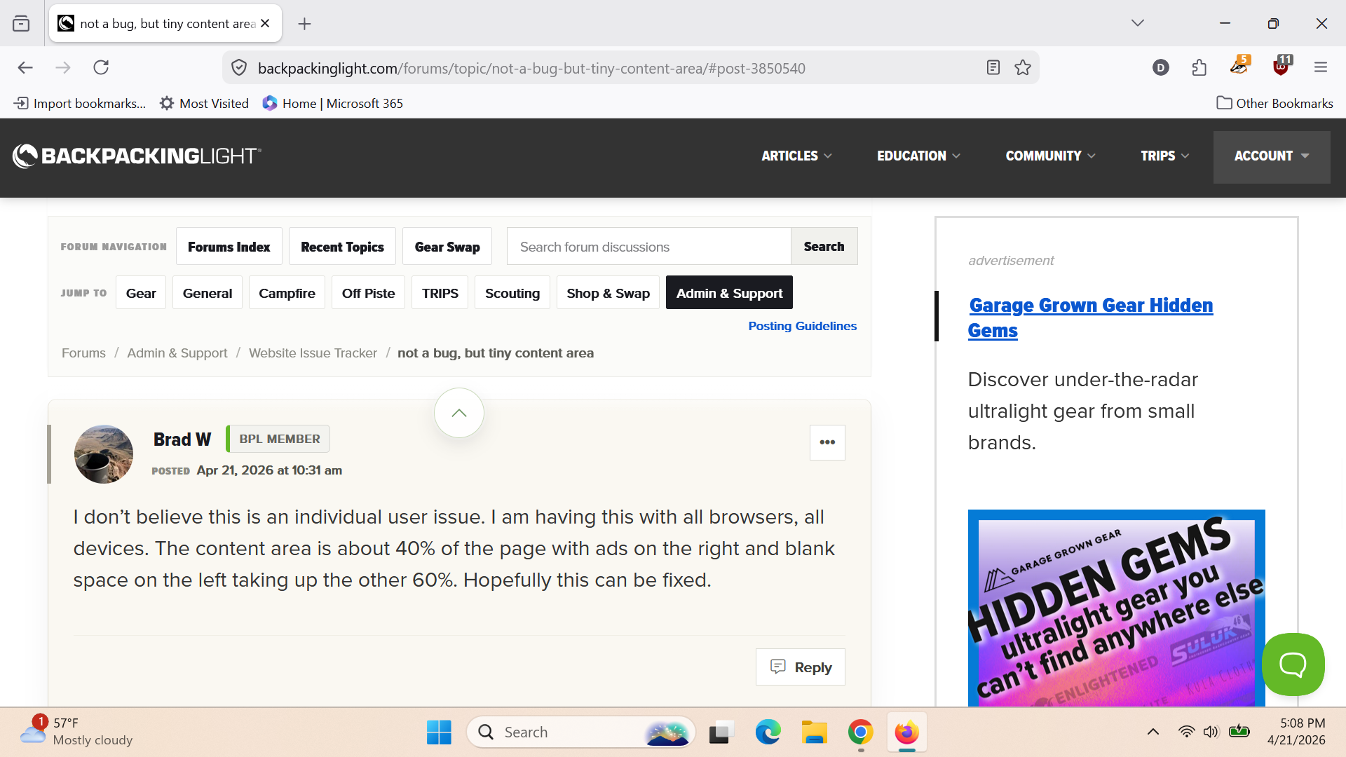
I’m on a laptop, resolution 1920×1080+0+0, 120 DPI, Firefox 148.0 maximized, not full screen.

I can see ~2 topics at a time in the topic lists, and about 1 post at a time if it’s quite short. Is there a way to collapse the navigation header or other elements so more of the page is occupied by the content area?

Screenshots:

Screenshot


its also a picture!

PostedApr 16, 2026 at 3:03 pm

Hi Jason – I’ve logged this as a feature request. We’ll investigate and figure out what options are available here. Thanks!

Jason M BPL Member
PostedApr 17, 2026 at 6:16 am

Not sure how, but this may be a profile issue on my end. Started FF with a new, clean profile and there’s a significant difference. I’ll start disabling extensions and work up to what might be causing it. Content area is still a bit small on a small screen, but we can blame the screen ;)

Let me know if you would like more info from my end.

clean profile viewport:

Again with the screenshots


Brad W BPL Member
PostedApr 21, 2026 at 10:31 am

I don’t believe this is an individual user issue. I am having this with all browsers, all devices. The content area is about 40% of the page with ads on the right and blank space on the left taking up the other 60%. Hopefully this can be fixed.

David Hartley BPL Member
PostedApr 21, 2026 at 3:20 pm

Yup, not great on my screen either. Here is my screenshot in Firefox – I would guess less than 40% content. I have what is supposed to be a 14 inch screen, but only approximately 13.3 inches is viewable. Resolution is 1920×1080. For starters the header is wider than it needs to be from a pure functional standpoint. Also, I would ditch the “JUMP TO” row, but maybe others like that (I don’t recall seeing a lot of Campfire, Off Piste, or Scouting content recently).

PostedMay 17, 2026 at 7:01 pm

Just a headsup that this is in progress. We are making some changes to “topic list” style pages (e.g., recent forum topics and individual forum index pages) today to improve some information density, and are leaving this issue open and we continue to tweak display output.

Brad W BPL Member
PostedJun 5, 2026 at 10:04 am

Any updates on this Ryan?  Having only 35-40% of a screen used for the actual content is challenging.

DirtNap BPL Member
PostedJun 5, 2026 at 11:39 am

Same here. Really bad on my little laptop. Workaround has been to zoom way out to like 50% FYI. Sometimes I can only see two lines beneath that behemoth banner. Ryan, I’d make that banner collapsible IMHO. The arrow just zooms to the top of the page, mostly useless for me, be nice if that areow collapsed the button banner. The buttons do have great utility though.

DirtNap BPL Member
PostedJun 5, 2026 at 2:37 pm

Banner appears to be minimizeable on mobile FWIW

Viewing 9 posts - 1 through 9 (of 9 total)
Loading...