The Member Gear Review listing has what I would regard as a fairly major usability bug.
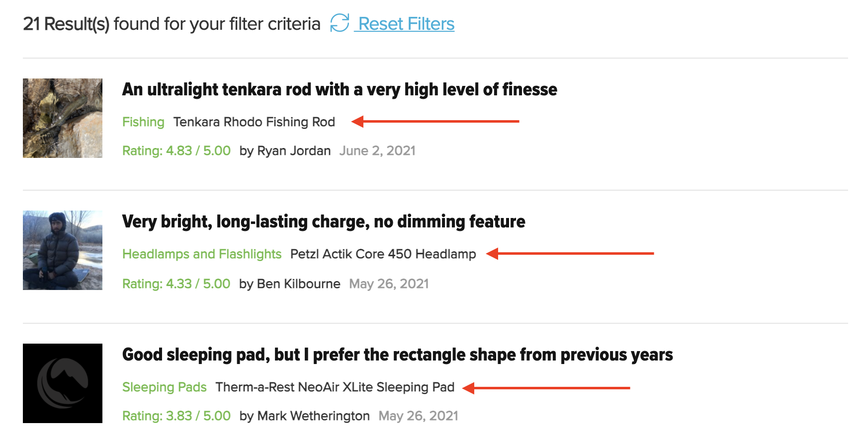
Here is a screenshot of 3 recent listings. I have no idea what product they are reviewing. This is what web UX pros call “Mystery Meat Navigation” – the user has to click the link to discover what the content is about. Research shows that it’s an egregious error – most users simply won’t bother and the content will go unread.
If you want this feature to take off, you really do need to improve the listing, I think.
I’d also suggest you add a filter for the type of product, such as Shelter, Sleep, Clothing, Cooking etc. As the section grows, this would make it far more navigable. I would suggest that when people are looking for reviews, they are primarily searching for a tent, stove, quilt etc, not for the more abstract and general ratings you have at present.
Potential a good feature, but I do think it needs some attention…