Topic

I like the new site design

Viewing 22 posts - 1 through 22 (of 22 total)
JCH BPL Member
PostedMay 29, 2021 at 7:10 am

I work in IT.  I have developed many websites and web applications.  Enough to know that you can never, ever, satisfy everyone.

That said I think the new site is a marked improvement in organization and readability.  It’s not “perfect” and it never will be, but all the work put in by BPL administration to implement these improvements should be recognized.

A very difficult job quite well done!


Geoff Caplan BPL Member
PostedMay 29, 2021 at 8:13 am

Having posted a few moans about the new site, I’d like to balance that by agreeing that overall the organisation and the look-and-feel is a great improvement.

It just needs a few usability tweaks – all part of the development process…

jscott Blocked
PostedMay 29, 2021 at 8:52 am

I like it too. Readability is great! Very bright and easy on the eyes. Clean.

dirtbag BPL Member
PostedMay 29, 2021 at 10:07 am

Same here. I like it.. just have to get used to it. 

I see I can easily post pictures here, but not in Gear Swap…

Anyway, kuddos on the upgrade! Job well done and eventually the little kinks will be ironed out, Im sure.  You still have my support and I will be around for some time!!

Matthew / BPL Moderator
PostedMay 29, 2021 at 10:11 am

I see I can easily post here, but not in Gear Swap…

Just in case anyone missed the change, Gear Swap has moved out of the forums and is now accessible in Gear > Gear Swap.

dirtbag BPL Member
PostedMay 29, 2021 at 10:30 am

I edited my post. I can easily post pictures here, but not in gear swap.

The new gear swap that is.. It won’t let me post pictures of my gear I listed.

John RB BPL Member
PostedMay 29, 2021 at 11:55 am

I also work in web/tech (ugh) and I can say that all these are true

  1. people universally hate and bemoan website change and usually its just childish grumbling AND
  2. sometimes the average enduser notices something (or more likely gets frustrated with something) that you or your web devs haven’t noticed, because that enduser just has a fresh pair of eyes AND
  3. sometimes those people are right that a particular change from a suite of changes is poorly done

As a longtime member I applaud you on the work you did and especially the document you laid out about the work. The ‘old’ (I remember the site before the last one) really had issues and I hope this one works out better.

I would chill on the popups though… Thats been done, and done and done, and people mostly hate them (newsletter signup, etc).

EDIT: found an error after posting this :-)  The “ol” (ordered list) items I posted above, where numbers are autoassigned, is a slightly bigger font size than “p” or paragraph text. Would have your web devs get on that. I think the ol li items are 20px on balance and the regular p are 17 or 18px.

obx hiker BPL Member
PostedMay 29, 2021 at 1:25 pm

Well I’m not in IT but have a business website and have been through 4 major iterations of that site and…

Agree with the posts by JCH and the thoughtful explanation of the process by by Jimmy Benson . And yeah we may spot a thing or two. It’s a process.

But love the look and learning to navigate. You can tell at a glance that a LOT of work went into this new site.  Thanks!

PostedMay 29, 2021 at 2:14 pm

I still can’t fathom why private message alerts are not available on the site rather than through email.

PostedMay 29, 2021 at 2:26 pm

PM alerts: that feature has been developed, but we haven’t fully tested it yet. We’ll finish that up and roll it out after we finish this initial round of bug reports, which will take a few weeks.

Bill F BPL Member
PostedMay 29, 2021 at 3:36 pm

Great job on the site re-design.  I know this was a huge amount of work especially for a small organization.  The great thing about software and digital applications is they can be continually improved and optimized.  I think marginal gains is something this community understands.  Well done & thank you!

PostedMay 30, 2021 at 7:07 am

The new design is clean, spacious and easy to read. Small changes in categorization I will get used to.

As an end user and web designer there are two things I noticed right off:

– Search feature easily seen and available on every page

– How To Post in Gear Swap video can’t find a working link, search turned up nothing


SIMULACRA BPL Member
PostedJun 3, 2021 at 11:13 pm

Signing in has become a HUGE hassle. Login should be on the main page, readable clear and obvious. We shouldn’t have to navigate through multiple pages on a duck hunt of “other” things to find the login option. What am I missing here?

JCH BPL Member
PostedJun 4, 2021 at 5:21 am

On the desktop site when not logged in, there is a “Member Login” link at the top of the page. On the mobile site, the “Member Login” link is somewhat hidden within the hamburger menu and at the bottom of the page.

When logged in on the desktop, the “logout” link is in the “Account” drop-down at the top of the page.  On mobile, the “logout” link in in the hamburger menu.

While this is a locationally inconsistent presentation of a pretty fundamental function, and it would be nice if login/logout were handled more similarly regardless of desktop or mobile sites, once learned this is not a terrible inconvenience IMO.

What I DO find to be a big annoyance is the loss of how the old site displayed my username at the top of the page.  This was an unmistakeable and immediate indicator of login status.  Since the contents of forum listings can depend on login status, and we are routinely logged out after some period of time, I find it important to verify login status when visiting forums.

Brad Rogers BPL Member
PostedJun 5, 2021 at 6:04 am

I haven’t had a chance to thoroughly explore it, but I like the new site as well.  I remember the disaster that was the transition from the old-old site to the old site and know it a lot of posters left and never came back.  This one was a lot smoother – good job BPL!!

Steve S BPL Member
PostedJun 6, 2021 at 10:18 am

The choice of colors is … “interesting”. A long time ago a graphic designer warned me against mixing text colors — makes for difficult reading. Much the same can be said for background colors that make text white. A name in normal text followed by a bright green “BPL MEMBER” is impolite to readers.

Bright colors are used to distract — and to my aging eyes — hurt when I read a page. I suggest that at a minimum the bright green be made a dark green. Darkening the blue is less important, but would also be appreciated.

Anything done to tone down the response buttons would be an improvement, for similar reasons.

SIMULACRA BPL Member
PostedJun 7, 2021 at 10:46 pm

On the desktop site when not logged in, there is a “Member Login” link at the top of the page

Nope, not there


On the mobile site, the “Member Login” link is somewhat hidden within the hamburger menu and at the bottom of the page.

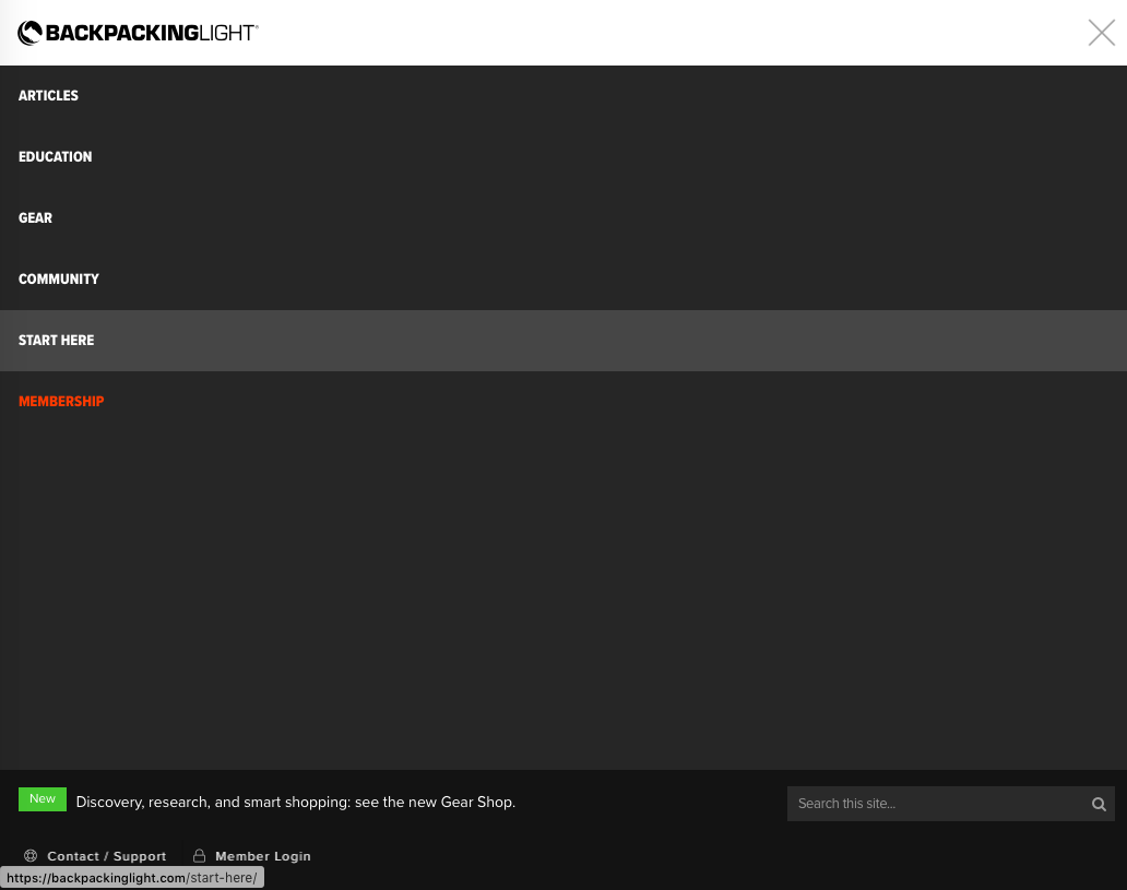
Still on the desktop site/”hamburger” menu. Can you notice down near the bottom left the tiny non distinct member login? Yeah, neither could I until logging in today. Barely noticeable. You kind of get thrown off by the BOLD “START HERE” and bright red lettering of “MEMBERSHIP”. Why look anywhere else? I have to agree with Steve S, the misappropriation of color fonts is misleading and distracting for what they are intended to be

David Sugeno BPL Member
PostedJun 8, 2021 at 3:12 pm

Simulacra, it’s not showing, because you’re logged in.  You have to be scrolled all the way to the top of the page (and logged out) for it to show.

SIMULACRA BPL Member
PostedJun 8, 2021 at 9:01 pm

@ David Sugeno

No, that’s incorrect.

I took those screenshots prior to logging in and both are scrolled to the top as you can see the Backpackinglight header. Regardless, it’s a mute point. Login is on the second page dropdown tab after navigating from home page traveling to the bottom and then selecting login tab. Simple

PostedJun 11, 2021 at 5:10 pm

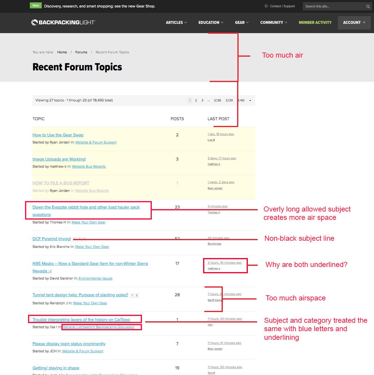
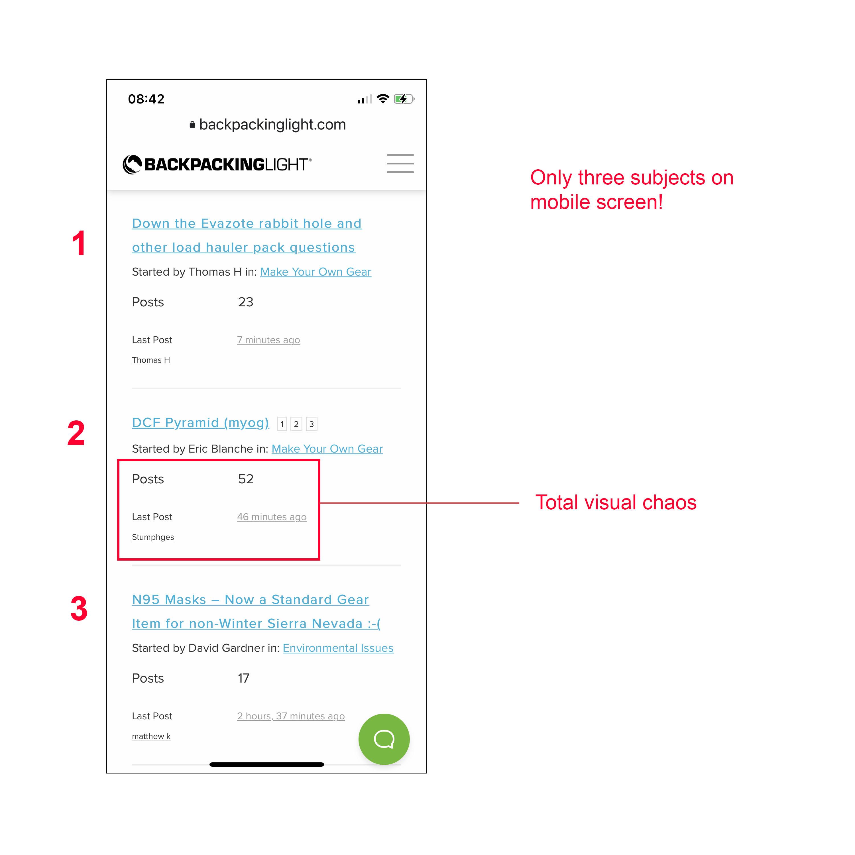
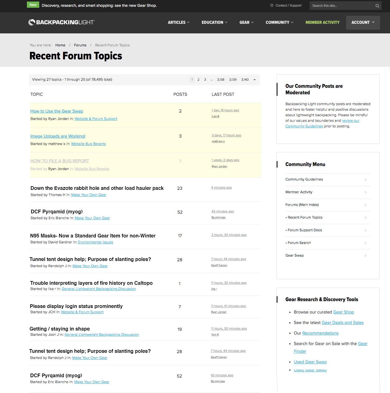
I have not explored all of the features and I am sure there are many improvements and back-end changes, but at the most basic level I think some things require adjustment. They include: there is too much “air” with not enough concise information displayed, requiring too much scrolling; a mis-use of color so that it confuses rather than clarifies; there is a lack of a bold and prominent subject-line; some visual confusion, particularly in mobile; and an over-use of underlining. I post some quick annotations and then a quick example of how some of these things could be improved just by changing simple parameters.

Mock-up of suggestions:

PostedJun 11, 2021 at 9:37 pm

Thanks for the suggestions. Next week we’ll finish up minor development bugs, and the week after we’ll be tweaking the UI. On our list already are font contrast issues, confusing layout of forum post meta (what you noted above as total visual chaos :), and excessive whitespace in some of the forum layouts.

Viewing 22 posts - 1 through 22 (of 22 total)
Loading...