I to am very affected by colors. Thus this is going to be a very subjective and opinionated post, but since you asked…
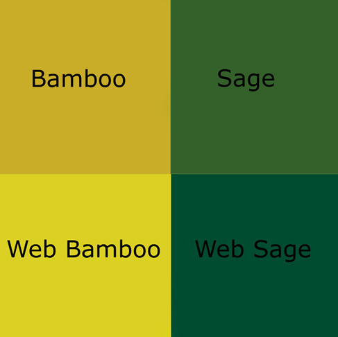
I really, really like the orange color of my GoLite Hex 3, and I really, really hate the bamboo of the Shangri-La series. I know this doesn't help you much, but there it is. I still think, however, that I would choose the bamboo over the sage.
I actually prefer the idea of blending in on principle, and I love the color green, but since I often hike solo, I have chosen safety colors over camouflage. Think about the difference in color from a rescue helicopter; the green pyramid tent will look like a small tree, whereas a bright orange tent will stand out.
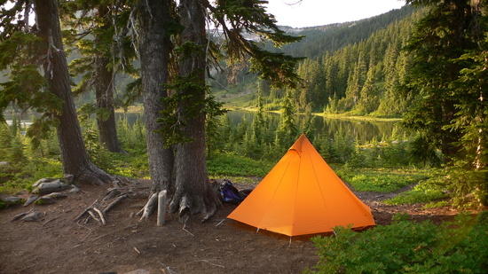
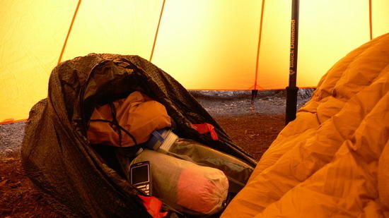
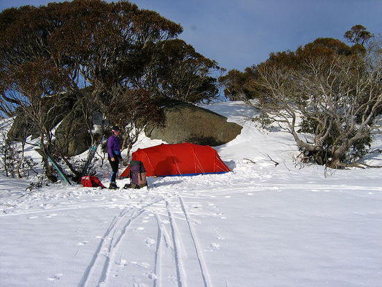
I came to appreciate the orange color even more once I started using the Hex 3 in rainy weather. Even on the bleakest, dreariest mornings my Hex 3 glows a wonderful, warm sunrise color inside. This really does something psychological for me. So much so that I'm considering painting my kitchen walls orange. I've seen this done in other houses in the PNW, where even on a gray day you get a very warm color. Here's two examples of what I'm talking about:
.
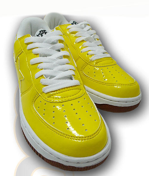
Unfortunately I can't say the same about the new bamboo color. I tried out the Shangri-la 1, and it was like puke-yellow. There is just enough of a dirtyness that it doen't provide that 'warm glow'. Instead it's a sickly, jaundiced glow. I think the true color is somewhere in between bamboo and web bamboo, on my monitor at least, but until you've been completely surrounded by the color on a gray day, you won't fully appreciate it.
So my advice; wait and see what the 2010 colors will be, or look for a used Hex 3. The good news is that a warm yellow has been selected as 2009's 'color of the year' here in the states, so we'll probably see a fair bit of products with this.
Last comment about blending in: I don't find the Hex 3 orange to be too disruptive to the environment; it is the color of sunrise, something that is very natural. The colors I find more offensive are the neon blue and neon green you see on many of the cottage gear silnylon tarps, and some bright reds (like my embarrassing Rab wind shirt).
p.s. I hope you don't find the omission of 'u' in 'color' too offensive! =)