Updated 22.Dec.17 – added mockup of mobile home page for logged in users
The vision of BPL-v5 is pretty simple: declutter the site, minimize irrelevant advertising, improve the user interface, provide better access to information, and make the whole thing more beautiful.
Right now, we’re working on design mockups.
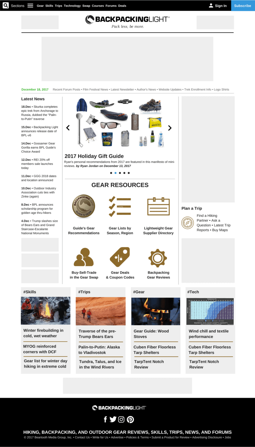
Here’s a sneak peek of one of the home page design mockups:

Some highlights:
- I really want everything on the site to be accessible from “the” menu, regardless of where you are on the site. No sense scrolling and clicking to get to where you want. So the current site’s top menus (there are two of them), are going to be consolidated into one menu, and it will remain visible and “sticky” on scroll, so you can jump to wherever you want to go, anytime.
- One of the most popular features we used to publish when Jon Davis and Eric Vann were our editors in 2015-2016 were the news articles, and I’d love to restore the feature of providing short snippets of information about current events. I’m still defining the logistics of how to do this, but I’m hopeful to incorporate current events (see “Latest news” in the mockup above) as part of the future of BPL, and to be featured as a prominent part of the BPL homepage.
- The “features” will be a “front-and-center” position – the premium spot on the homepage. I don’t want to waste this space with ads or other clutter – time and again our click tracking has proven that this part of the page is the most important, and I want to make sure that it directs you to our latest feature articles. I’m guessing that 3-5 articles will appear here on a rotator (ex. – see “Holiday Gift Guide” in the mockup above).
- Based on feedback from our readers, and our traffic statistics, the second most important sections of our site (after the “features”) are Guide’s Gear, Gear Lists, Where to Buy Gear (i.e., “Suppliers”), Gear Swap, Gear Deals, and Gear Reviews. Obviously, lots of info about gear is important to you, so we plan to consolidate this info into the “GEAR RESOURCES” section of the home page.
- Other feedback suggests that “Trip Planning” resources are very important to our readers, so we’ll keep this info high in the right sidebar of the homepage.
- Our four most popular article types are “skills, trips, gear, and technology” and we’ll feature the latest articles from these sections in the bottom of the homepage.
- We’re simplifying and decluttering the footer. It’s somewhat important for search engine positioning, but otherwise, should simply contain the links for ancillary stuff that small audiences are interested in. Advertising, authoring content, product review info, etc.

Finally, mobile is going to be heavily redesigned, and will result in a significant reduction / demotion of banner ad positioning, better access to all content with a sticky menu on scroll, easier readability, and more content designed to serve the sections of our site that are most popular for our users. Mobile mockup of the home page to the right, click for bigger.
Note the light gray rectangles scattered throughout the home page.
Some will look at these rectangles, and say, “Oh God, no. Not advertising.”
I hear you.
Granted, ads will be rotated in these slots, but I have a very strong motivation to reduce advertising impressions in BPL-v5, for two reasons:
- First, irrelevant ads suck and I don’t want to waste precious BPL real estate on them.
- Second, we’ve discovered through A/B testing in 2016-2017 that decreasing ad density actually increases ad revenue. Go figure.
So these gray rectangles are in place to house secondary content that will be used for the following purposes:
- Advertising (duh) – both banners and text ads.
- Internal promotion of BPL articles – both old (from the archives) and recently published content.
- Forum threads that receive high levels of traffic.
- Gear deals that serve BPL’s affiliate merchants.
- BPL news and announcements for events and activities, e.g., our film festival, adventure treks, or upcoming clinics.
In addition, I’m writing the code that ensures that these slots don’t have to be used for anything, so if there’s nothing valuable to put there, they’ll just disappear. The last thing I want to do is backfill these slots with a bunch of irrelevant Google AdSense ads. Ugh. No thanks.
Questions, comments, feedback? Feel free to write us at [email protected].


